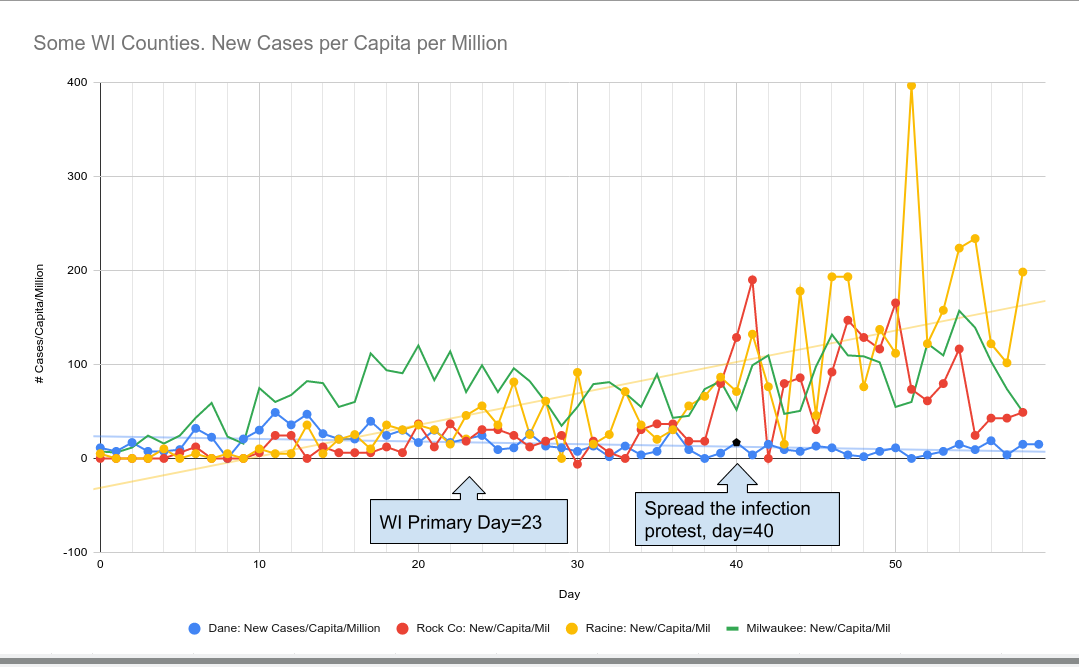
2020-05-13: The science of spreading disease states that the more exposure to a virus, the more likely you are to be infected. And we see that clearly in COVID-19 as those counties most likely to participate in the "Spread the infection" protests became those counties with the largest increase in per-capita infections. 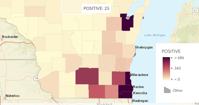
This map is from the Wisconsin DHS ( https://data.dhsgis.wi.gov/datasets/covid-19-data-by-county?geometry=-99.636%2C42.236%2C-78.718%2C45.019&selectedAttribute=POSITIVE) but because it's not a PER-CAPITA map it doesn't show how much of a spike is really happening in the counties that had a population that protested.
For that we can get the raw per-county data over time and with per-capita rise you can really see the difference between say Dane county and Racine County.
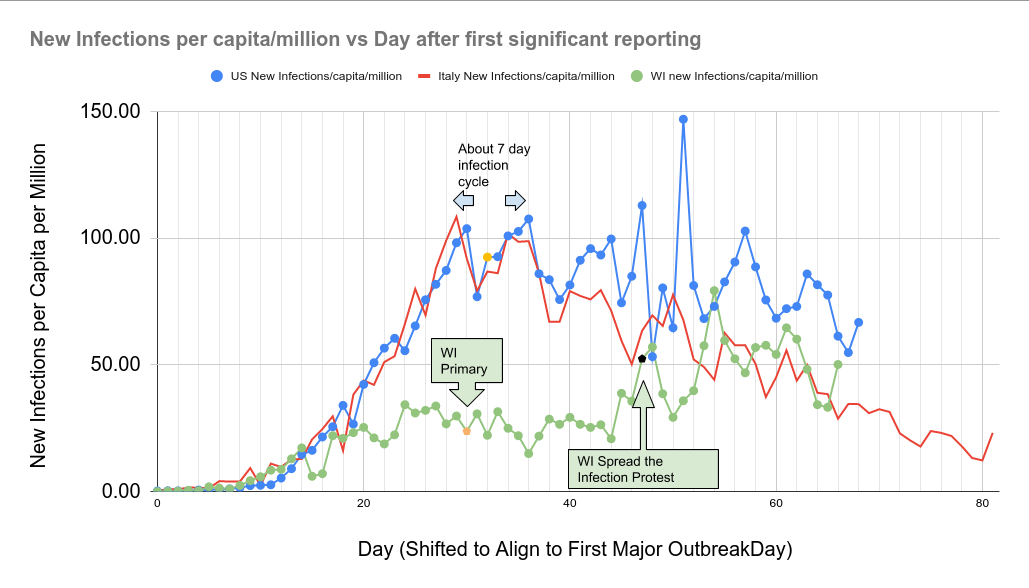
This spike in counties in WI that disregarded the science of infection is being found now all over the US in similar areas:
One can really see the difference between WI with people actively trying to spread an infection and Italy which doesn't have such a large group.
WI data from
https://data.dhsgis.wi.gov/datasets/covid-19-historical-data-table/data?page=6&selectedAttribute=POS_NEW
https://docs.google.com/spreadsheets/d/1joRSrEp3SquHnvxTR6mJzLbTLCYlk05_XPZXWF-o6zs/edit#gid=0
- Log in to post comments